Designing for an established industry is pretty straightforward, but how do you create a brand for something… new?
That’s the question we were faced with when we decided to rebrand from Cloud Agronomics to Perennial.
Why now?
Soil carbon markets have gotten a lot of attention in the last few years—and rightfully so—but they are still fundamentally new. We knew we wanted to be the first company to transform soil carbon removal from something new into something familiar, trusted, and ubiquitous. In other words, we wanted to turn soil carbon from a hopeful concept into an everyday reality that helps sequester millions or billions of tons of CO2 from the atmosphere. We realized our old brand didn't focus enough on these key aspects of our market, so we went to the drawing board.
How do you design a brand that captures all of that while remaining simple, approachable, and familiar?
To approach the problem, we joined forces with the incredible team at Jory&Co, a UK and NZ-based design studio that focuses on organizations with positive environmental impact.
“We were brought in to help support Cloud Agronomics with their next stage of growth. The old brand and name didn't accurately reflect their developing business or platform and their future ambitions. The rebrand helps cement Perennial's position as a disruptive, innovative, industry-leading, climate tech brand.”
—Ben Jory, Creative Director @ Jory&Co
We settled on these must-have brand associations:
- trust and leadership
- scale
- science, technology, and innovation
- eco-orientation
- ethical values
Trust and Leadership
To evoke the sense that Perennial is a trusted leader in an emerging market, we knew the brand had to be simple, articulate, and able to say a lot with a little.
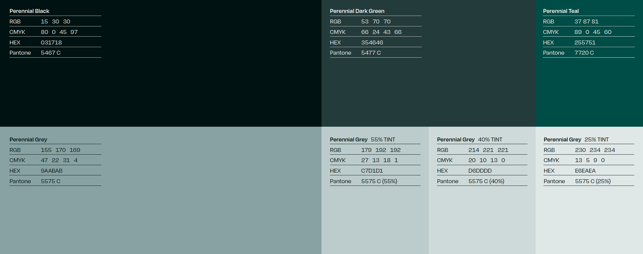
Our core colors are simple, neutral, precise tones which give the sense of solidity and intentionality — they let the viewer know that everything is right where it should be.
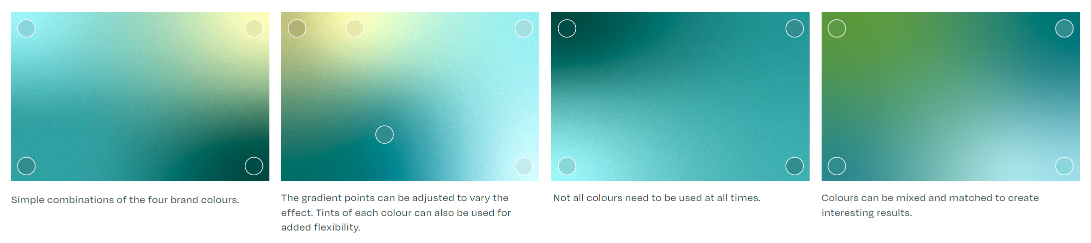
However, true leaders know where and when to break the mold and take actions which are new, exciting, and maybe even a bit surprising. That’s where our gradients come in: an organic, multifaceted flash of color that, used in moderation, introduces the perfect amount of surprise into our visual language.
Taken together, the Perennial brand stands for a company that you can trust, and one that will help lead the soil carbon movement for years to come.
Scale
Our platform is built for scale, because in order to make a true impact on our carbon problem, we need to enable climate-smart agriculture to operate at the hundred-million-acre scale without cost barriers to the grower.
Scale ties in with the Perennial brand through the use of linework and patterning that elicits a birds-eye view of agricultural land. The squares, rectangles, dots, and circles are what happen when you take a big-picture view of farmland.

You’ll notice the same patterning in our logo, showing just how committed we are to this big-picture view.
Science, technology, and innovation
You might notice that Perennial’s brand looks different from pretty much every agriculture or soil carbon company out there. Since our product stands out from everyone else’s, why not our brand?
Coming soon are powerful illustrations that boil down the complex research behind our technology into approachable, understandable, and beautiful visuals.
Eco-orientation
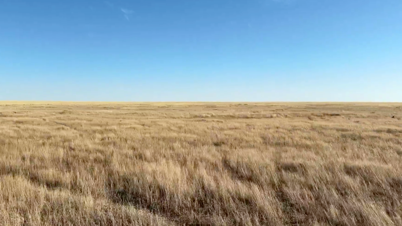
At Perennial, we believe that natural ecology is worth protecting, but also that the most promising climate solutions will be unlocked by harnessing the immense power of nature. As a result, we knew the brand needed to harken back to nature.
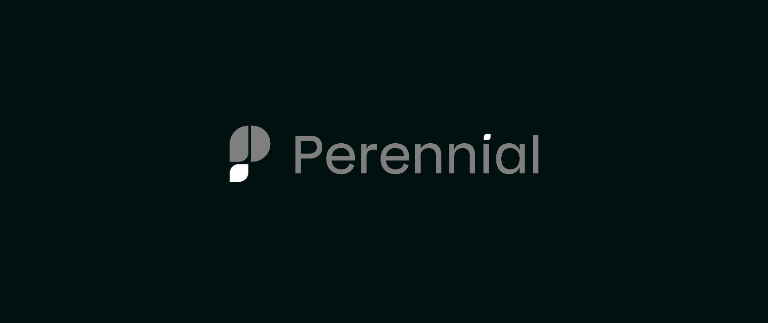
We introduced a hidden leaf into our logo to keep nature first and foremost. The leaf is apparent in the standalone P iconography, and is echoed in the textual component of the logo.
You’ll also find striking views of nature in all the photography used to tie together the illustrative elements of the brand.
Ethical values
Every company, especially every startup, is lost without a strong sense of values. Our values are communicated through the last element of the Perennial brand: the content which we produce. We strive to craft every statement, sentence, and idea in a way which signals and upholds these values:
- Speak your truths, welcome new voices.
- Celebrate your successes, own your mistakes.
- Solve important problems.
- Invest in each other.
- Build for the future.
- Get your hands dirty!
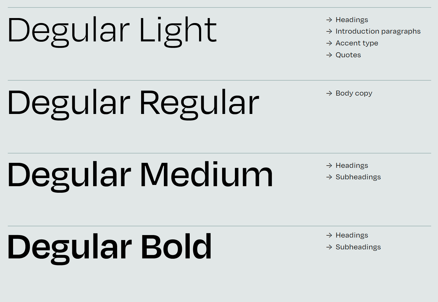
As the typography that underpins our content, we chose the Degular typeface for its character, subtlety, and versatility.
Looking ahead
Thanks for taking the time to read about the brand foundation we’re building on. Once again, thank you to the incredible Jory&Co for helping bring our vision to life.
The Perennial brand will continue to grow and evolve, as will the soil carbon markets, contemporary climate issues, and how we address the most pressing problems of our time. We’re excited to see what’s next, and we hope that you’ll join us on that journey.
—David
Co-Founder of Perennial